English version of the training video for Simple (available in multiple languages)
One year ago (in October 2018), we piloted the Simple app in five public health facilities in Punjab, India. The original process of teaching healthcare workers to use Simple in pilot hospitals involved in-person trainings from members of our team. We flew from Bangalore to Bathinda, spent a week visiting one facility each day, and taught healthcare workers how to use the app. We’ve come a long way since then.
Simple is now used in over four hundred health facilities in two states. Intensive in-person training is hard to scale, so we had to figure out how to make it easier.
Most other clinical software requires significant investment in training. One goal of Simple is to be able to get a healthcare worker up and running with minimal assistance, within an hour of installing the app. It’s a high bar, so we tried many approaches to explain Simple to our users.
In brief: A short, instructional training video with examples worked best by a long shot, but here are some other ideas we tried.
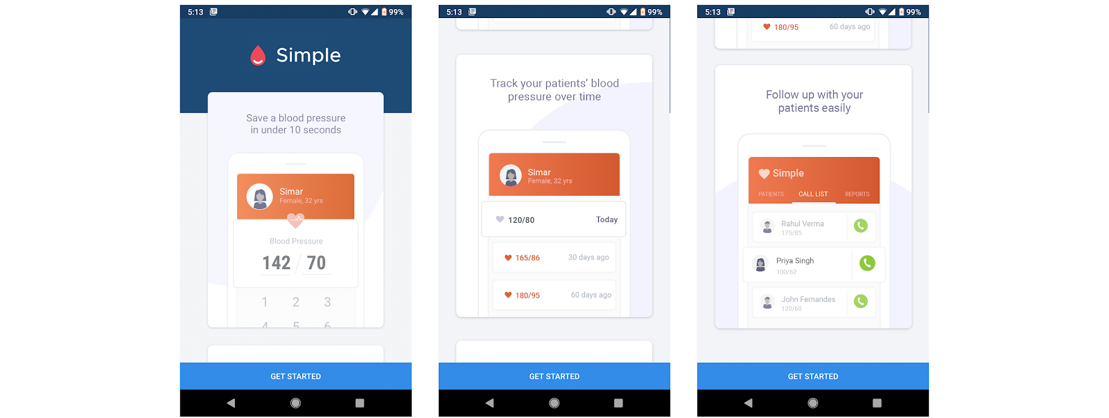
Tour on the home screen

First attempt at onboarding users
When our user tester Tanushree Jindal watched users trying the app for the first time, she observed that most users went straight for the “Get started” button, without scrolling through the screenshots that we had put together. Not great.
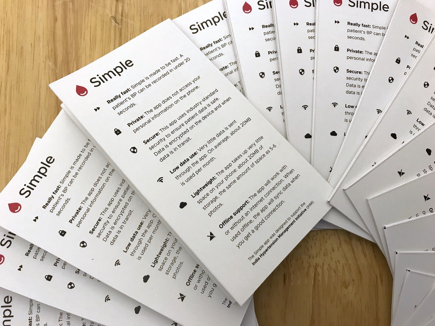
Paper training handbooks
We created a quick handbook that we could leave behind at in-person trainings. The handbook was pretty helpful, but keeping it updated was a challenge. Besides, they were not easily accessible unless we hand-delivered them.

Training manuals
Coach marks!
We then came up with the idea of using ‘coach marks’ to guide the user through the functions of the app. Maybe we could introduce each feature contextually to our users?

Coach marks to contextually introduce new features
We ran extensive usability tests with nurses and realised that there were simply too many coach marks to read. Coach marks were either ignored or got in the way. This didn’t work well either.
A simple video worked best
During field visits, we identified that a brief, engaging training video with demonstrations could have a lot of impact. So we quickly recorded a friendly video where we enacted the key activities in Simple. This worked really well during user tests and we learned:
- Almost all healthcare workers watched the video
- After 5 minutes, users became restless and lost interest
- After watching the video, users could explain the app back to us
- Nurses felt relatively confident that they could use the app after watching the training video
We edited the original video down to a crisp 5-minute film that showed a healthcare worker (me!) caring for a patient with hypertension at their clinic. This really hit home, as it was a very relatable setting for the primary users of our app.
We plan to make the recording available in multiple regional languages, so users can watch it in the language of their choice.
Where we are now
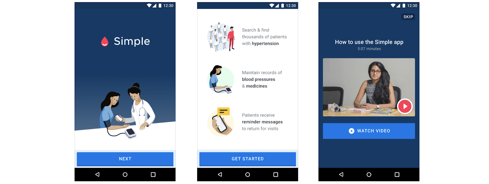
Today, the video is part of our short, in-app onboarding process for Simple. A nurse or a doctor can install the app from the Play Store, watch the training video as part of the registration flow, and learn how to use Simple.
The video is always available inside the app, within the built-in HELP section. One key benefit is that the video is nice, but not too fancy. As Simple evolves, we can easily replace it with an updated film that is more relevant.

Current onboarding flow
In addition to users, trainers have given us very positive feedback on the video, as it has proven to be a valuable tool for in-person trainings. Program managers, who go to the point of care to guide users on how the India Hypertension Control Initiative program should be implemented, play the video to demonstrate how Simple fits into the clinic workflows.

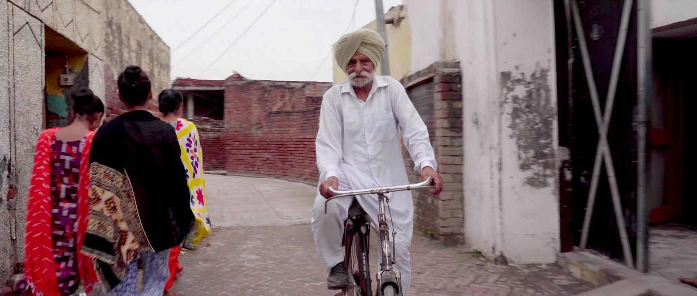
What trainers and users have to say about the video
What's next?
Our takeaway from this exercise? Every mode of training had merits, but a contextual demonstration is a powerful tool that seems to hold a user’s attention. We have since recorded a few other videos that demonstrate specific flows in the app, and these have been received with equal enthusiasm.
The goal for the program is for it to eventually be entirely self-sufficient. We believe that by empowering users to teach themselves, we are taking the first important steps in that direction.
Credits
Thanks to Daniel Burka for scripting the first draft, and Anand Rama Krishnan for making us look good in the video. Also, thank you to Akshay Verma and Tanushree Jindal for user testing in the field. :)


